-
Posts
11,403 -
Joined
-
Last visited
-
Days Won
1,283
Everything posted by BikerScout007
-
Also the height is WAY off. Our further appraisals of the cummerbund, based on the Costumes book and Gino's scout, puts the cummerbund height somewhere in the neighborhood of 8 to 9 inches. We have really been getting away from the old style 501st bund that looked more like a tube top than a cummerbund. Now this height measurement can vary based on the trooper (the bund should run from just under the chest armor to the top of the belt), but 8 to 9 inches is a much better starting place than 12 inches.
-
This pattern isn't quite right though. It has too many vertical lines in the center (there should be only 6) and many of us are not attaching the codpiece to the bund any more but making it a separate piece that attaches to the vest, as was done in the movie
-
Different Parts From Different People (Armor)
BikerScout007 replied to Skithiryx's topic in Getting Started
Hey Patrick! We mix and match because some armor makers do a better job with some pieces rather than others. It is very common to mix and match helmets and armors. Also, some vendors are faster and more reliable than others, and they tend to get more business. You can take a look at this thread for comparison photos of the major armor builders vs. the Scout armor from the movie. http://forum.bikerscout.net/index.php?showtopic=17774 I wouldn't worry too much about the armor when it comes to your chest. The real place that may cause issues is with your soft goods, such as the vest and the cummerbund. That you will have to work out when you give your measurements to the soft goods maker you commission Welcome to the Pathfinders! -

The Ultimate Armor Comparison Thread!
BikerScout007 replied to BikerScout007's topic in ROTJ Biker Scout Armor/Helmet
Okay, I put the photos on a new hosting site. Hope everyone can see them again! -

The Ultimate Armor Comparison Thread!
BikerScout007 replied to BikerScout007's topic in ROTJ Biker Scout Armor/Helmet
Yeah I'm a little short the $400 they want for annual photo hosting I will try another hosting service! -
Yeah what Glen said. As a Scout you want your stuff to get scuffed up!
-
Awesome work, Shaina!
-

Advance Recon Team (ART) discussion
BikerScout007 replied to BikerScout007's topic in Advance Recon Teams
I followed you! Sent from my LG-H830 using Tapatalk -

Advance Recon Team (ART) discussion
BikerScout007 replied to BikerScout007's topic in Advance Recon Teams
That's a great one. I like how it looks like something from the National Park Service Sent from my LG-H830 using Tapatalk -

Advance Recon Team (ART) discussion
BikerScout007 replied to BikerScout007's topic in Advance Recon Teams
That's cool! Sent from my LG-H830 using Tapatalk -

WTF drop boxes, looking for advice.
BikerScout007 replied to koyuhelio's topic in ROTJ Biker Scout Armor/Helmet
Here is a picture of Gino's dropboxes. You will also need to cut a crescent shape into the top so they can rest against your legs better- 1 reply
-
- 1
-

-

Reference Pictures For Biker Scout?
BikerScout007 replied to StormyStormtrooper's topic in ROTJ Biker Scout HQ
There's this movie you might want to give a watch.... -

SC helmet eyes & ears... looking for feedback
BikerScout007 replied to BuckeyeTK's topic in ROTJ Biker Scout Armor/Helmet
That looks really great man. The SC eye area is always a little too small but it looks like you widened it out. Good job! -
Gino painted his red stripe all the way down the sides. Also his had a red bar across the top and not a white circle. He said that when he saw the Scout armors at the archives, each tank had a different design on it. It's possible the white circle is just one such design. But that's the one we are requiring for now
-
What I did was: go....real....slow It helped to put the two vertical pieces on first so I could eyeball where to line up the horizontal piece
-

Advance Recon Team (ART) discussion
BikerScout007 replied to BikerScout007's topic in Advance Recon Teams
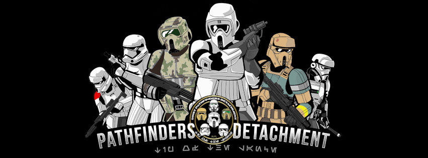
I'm gonna show off our ART's logos The main logo: The Shoretrooper variant: -
Either one would fit fine. I have a big head and used a KS at one time with no issues. Sent from my LG-H830 using Tapatalk
-
I got a hot knife at Michael's for 20 bucks. Cut through my sole like butter. But do it outside unless you dig burning rubber fumes! Sent from my LG-H830 using Tapatalk
-

Advance Recon Team (ART) discussion
BikerScout007 replied to BikerScout007's topic in Advance Recon Teams
Awesome! Leading the way -
Awesome! You're off to a great start Sent from my LG-H830 using Tapatalk
-
And here is a shot of the front:
-
You don't need to go that high on the back. That would be a better shape for the front of the patch. Also, you don't need to go so far down the knee. Looks pretty good though. Make it more like this:
